


Training data as the foundation for AI In today’s data-driven world, the ability to not only access but also interpret large datasets is essential for businesses, researchers, and decision-makers. However,…
Table of Contents
Training data as the foundation for AI
In today’s data-driven world, the ability to not only access but also interpret large datasets is essential for businesses, researchers, and decision-makers. However, static charts and graphs often fail to capture the full story behind the numbers. That’s where dynamic data visualization comes in. It’s an interactive, flexible way to present data that helps users gain deeper insights, make faster decisions, and uncover trends that may have otherwise gone unnoticed.
But what exactly is dynamic data visualization, and how does it differ from traditional methods? Let’s dive into the concept and explore how it’s transforming the way we work with data.
1. Defining Dynamic Data Visualization
At its core, dynamic data visualization refers to the real-time, interactive presentation of data that can change based on user inputs or evolving datasets. Unlike static charts or graphs, which display a fixed set of information, dynamic visualizations allow users to explore the data more deeply through interaction.
Key features of dynamic data visualizations include:
- Interactivity: Users can manipulate the data by zooming, filtering, or adjusting variables in real-time. This creates a more engaging and informative experience.
- Real-Time Updates: These visualizations often pull data from live databases, updating instantly as the underlying information changes.
- Custom Views: Users can tailor the data display to focus on specific areas, compare different datasets, or adjust timelines to reveal trends over time.
“Dynamic data visualization allows users to interact with data, making it a more flexible and insightful tool for decision-making.”
2. Differences Between Static and Dynamic Visualization
While static data visualizations like bar charts, pie charts, and line graphs offer a snapshot of data, they have limitations. Static visuals are ideal for showing fixed data points but lack the flexibility needed for deeper analysis.
Dynamic visualizations, on the other hand, allow users to dive into the data. Here are key differences:
- Static Visualization: Presents data in a fixed form. It’s easy to create but lacks interactivity and flexibility.
- Dynamic Visualization: Interactive and adaptable, letting users manipulate data in real time. For example, users can filter out specific variables or focus on specific time periods to understand trends or anomalies.
There are several benefits to using dynamic data visualization in business, academia, or even journalism:
Benefits of Dynamic Data Visualization
4. Common Tools for Dynamic Data Visualization
There are many tools available that make dynamic data visualization accessible for businesses and individuals alike. Some popular tools include:
- A popular choice for businesses, Power BI allows users to create interactive dashboards and reports with real-time data. It connects to multiple data sources and offers extensive customization options.
- Tableau is another leader in the data visualization space, offering dynamic charts, graphs, and maps that can be used to build interactive dashboards. It’s user-friendly and integrates easily with various data sources.
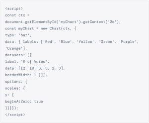
- For more technical users, D3.js is a JavaScript library that allows for highly customized dynamic data visualizations. It requires coding knowledge but offers unparalleled flexibility for creating interactive visuals.

Sed ut perspiciatis unde omnis iste natus error sit voluptatem accusantium doloremque laudantium
Lorem ipsum dolor sit amet, consectetur adipiscing elit, sed do eiusmod tempor incididunt ut labore et dolore magna aliqua. Ut enim ad minim veniam, quis nostrud exercitation ullamco laboris nisi ut aliquip ex ea commodo consequat.
See More
5. Examples of Dynamic Data Visualization in Action
There are many tools available that make dynamic data visualization accessible for businesses and individuals alike. Some popular tools include:
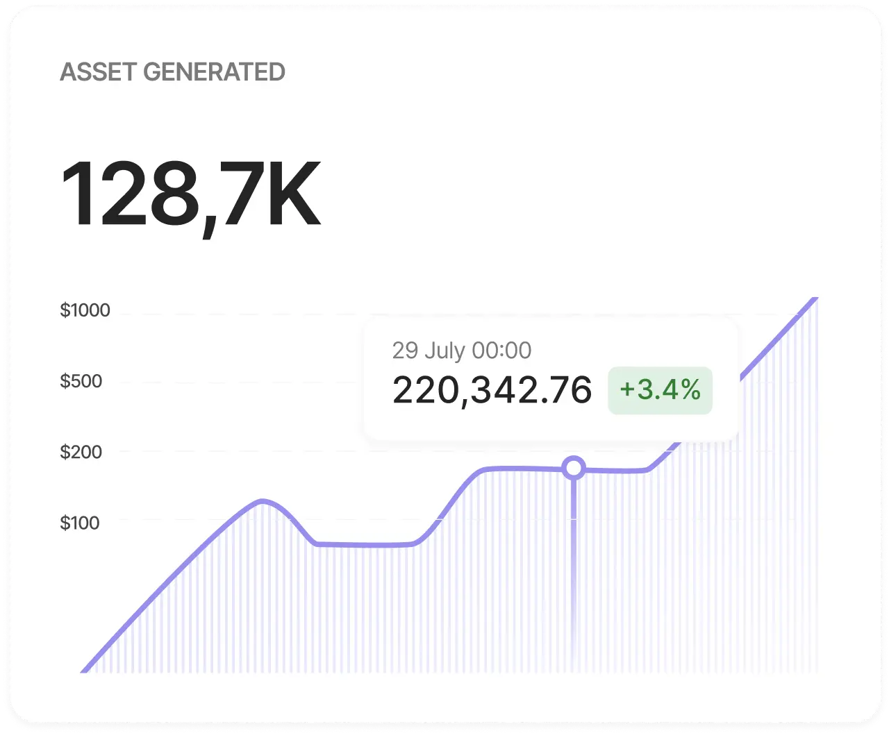
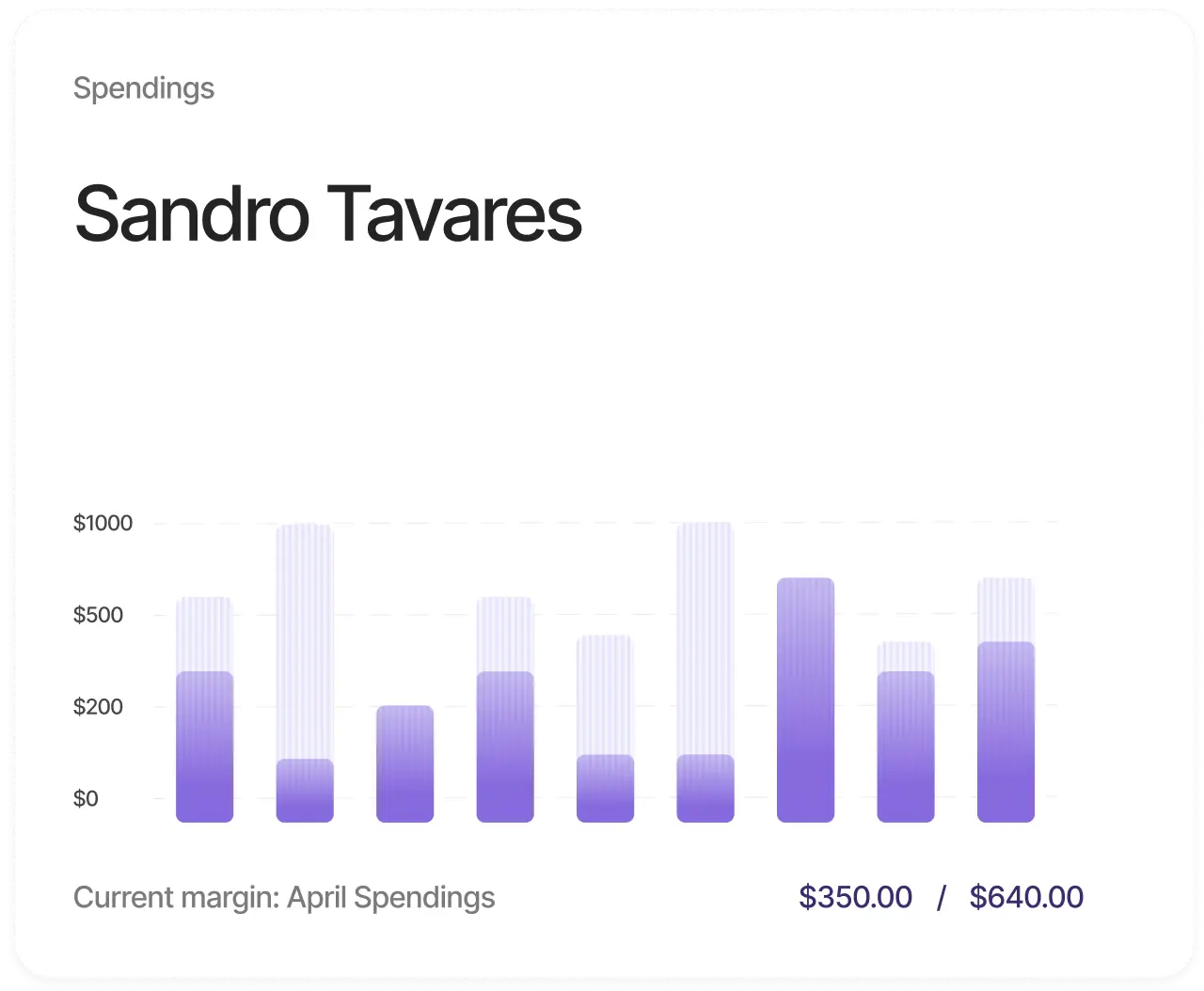
- Real-Time Sales Dashboards Many companies use dynamic dashboards to track sales performance in real time. These dashboards allow sales teams to monitor metrics like revenue, conversion rates, and lead sources, adjusting their strategies as needed.
- Interactive Maps Interactive maps are often used in journalism and research to show geographic data, such as population density, election results, or environmental trends. Users can zoom into specific regions, compare different areas, and see changes over time